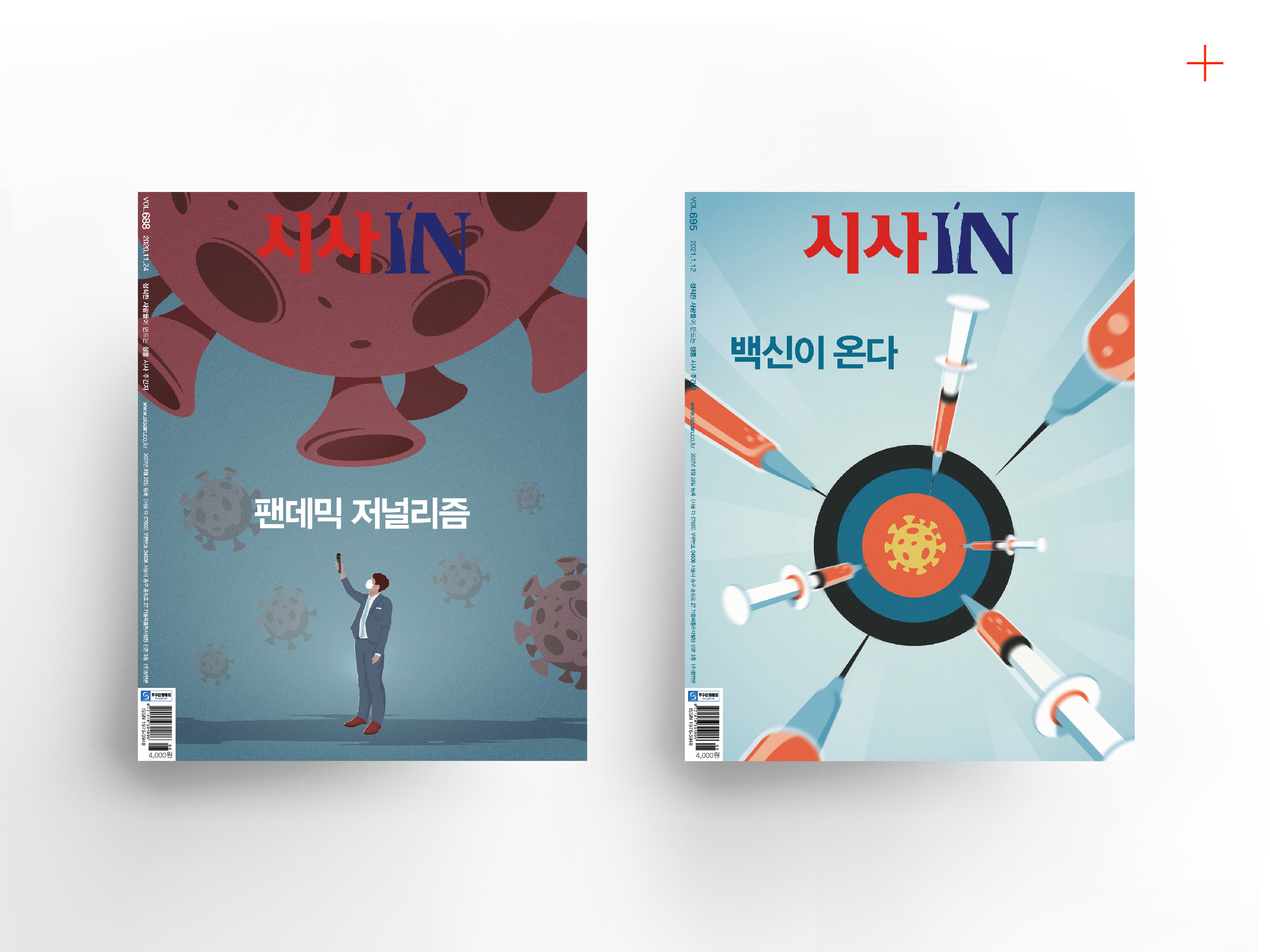
The cover story of SisaIN 688th edition is about "Journalism in a Pandemic." The cover story of this issue highlights the best reports on the Covid-19 pandemic around the world .This cover graphic features journalists interviewing with the coronavirus directly. It illustrates they are reporting detailed stories.
Published in SisaIN 688th, Nov. 2020
(right)
This cover graphic features an image of Covid vaccines are coming through syringes flying toward the middle of the target plate shaped like the virus.
Published in SisaIN 695th, Dec. 2020
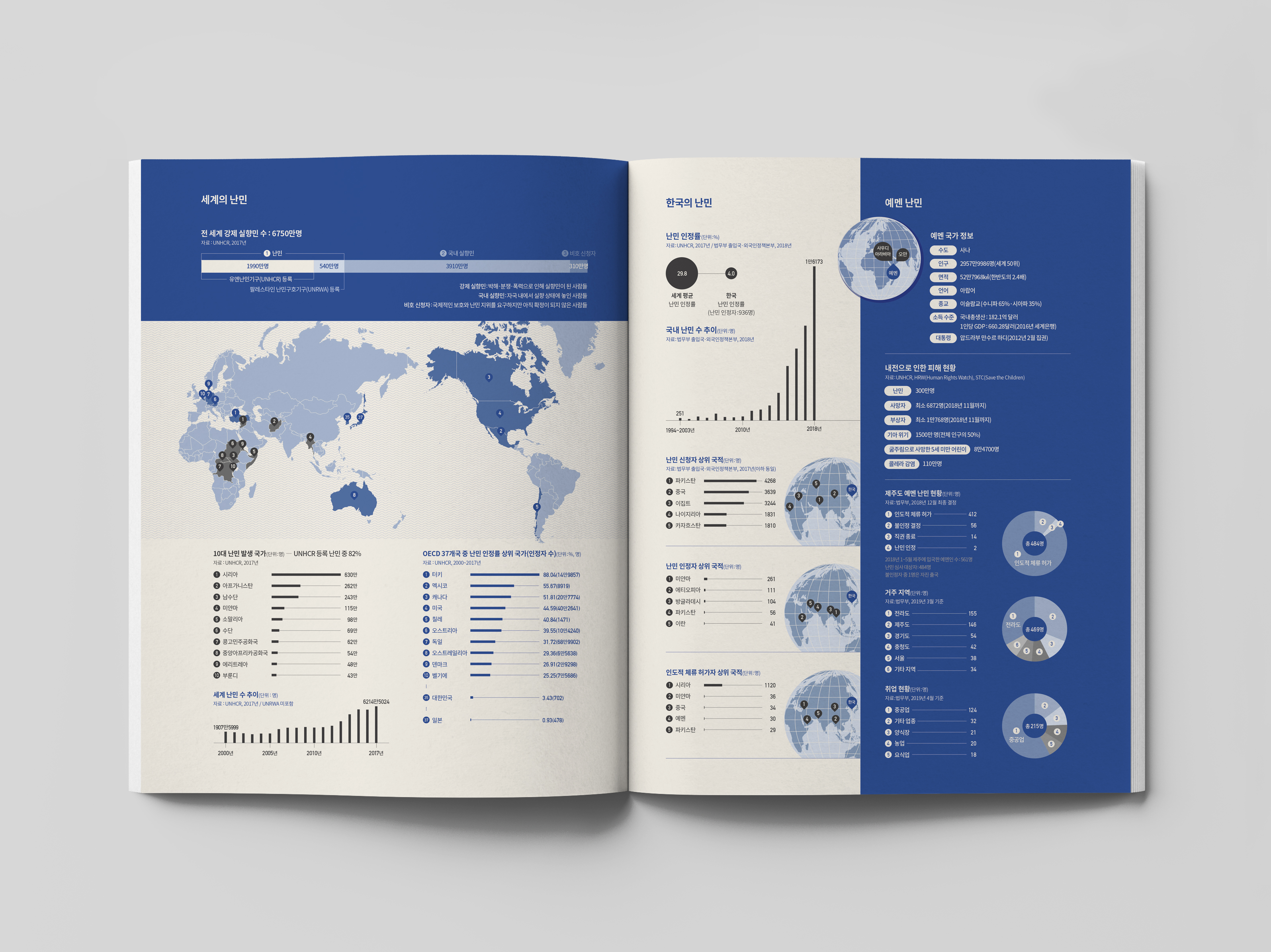
This is a visualization of data about 67.5 million people forcibly displaced around the world. According to the UNHCR, 4.25 million people per day flee from their homes to seek protection within the borders of their own country or other countries.
The graphics on the left page show which countries have the highest number of refugees and which of the 37 OECD countries recognized refugees the most. The graphics on the right page show information about refugees fled to
South Korea.
Published in SisaIN 613th, 2019
Refugees around the world and South Korea
![]()

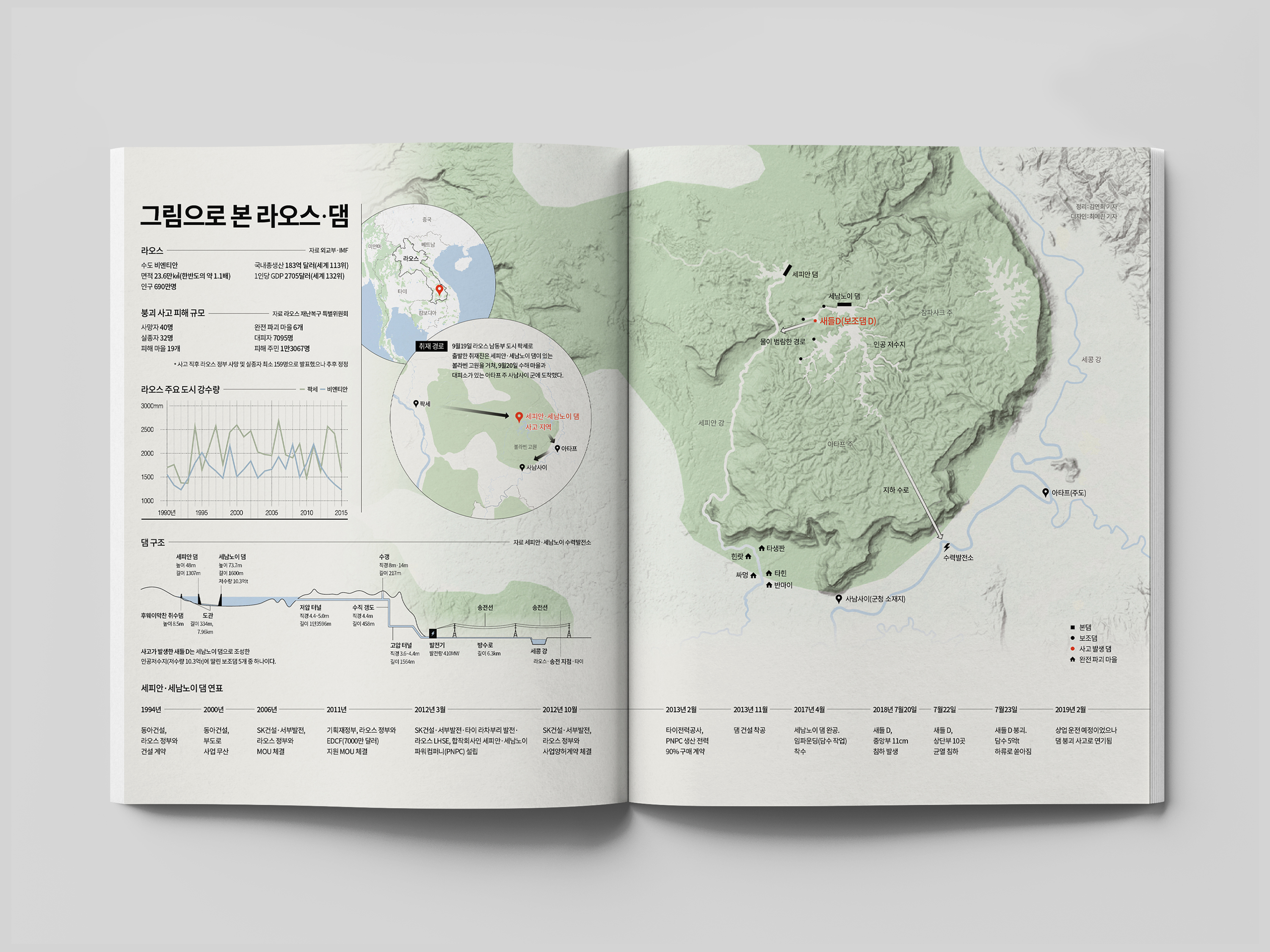
This is an infographic about the Laos dam collapse, which was the collapse of Saddle Dam D, part of a larger hydroelectric dam system under construction in southeast Laos's Champasak Province, on 23 July 2018.
It was designed to help readers understand the accident. The left side shows general information about Laos, accident damage scale, dam structure, and the timeline of dams. The right side shows a map telling the location of the dams collapsed with surrounding areas, plus the route of coverage.
Published in SisaIN 578th, 2018
Laos dam collapse
![]()


